Ads & Funnel
The landing page that makes your ads convert: anatomy
A landing page converts when it keeps the promise the ad made: same message, one goal, trust signals, a short form, and fast loading. Every extra distraction is one less conversion.
Why you need a dedicated landing page (not your homepage)
A landing page is a page built for a single goal: turning someone who clicked an ad into a lead or a customer. Your homepage cannot do that job well, because it exists to tell the whole story: who you are, what you do, how to reach you. When you pay for every click, that dispersion has a direct cost.
Someone who clicks an ad has one specific promise in mind, the one they just read. Land them on the homepage and they have to go hunting for it through menus, sections, and links, and most people will not: they hit the back button. A dedicated landing page removes the problem at the root, because it opens with the same promise the ad made and offers exactly one action to take.
This is the funnel principle at work: ads bring the right people in, the page turns them into customers. And a landing page for your ads does not mean rebuilding your website: it is a small, fast project, with a much lower cost than a full site.
Message match: consistency between ad and page
Message match is the consistency between what the ad promises and what people find on the page: same promise, same offer, same language. If the ad says one thing and the landing page says another, the person who clicked feels like they landed in the wrong place and leaves, even if the offer was good.
The classic example: the ad promises "free quote within 24 hours" and the page opens with "welcome to our firm, serving clients since 1998." Nothing false about it, but the promise that earned the click has vanished. The visitor has no interest in verifying whether it is still there somewhere: they assume it is not, and they go.
In practice, the match works on three levels: the headline repeats the words of the ad, the visual echoes the image or video the person just saw, and the offer is the same one, with no surprises or conditions that appeared out of nowhere. We dedicated a full guide to this: how to align ad, landing page, and offer.
The elements that convert
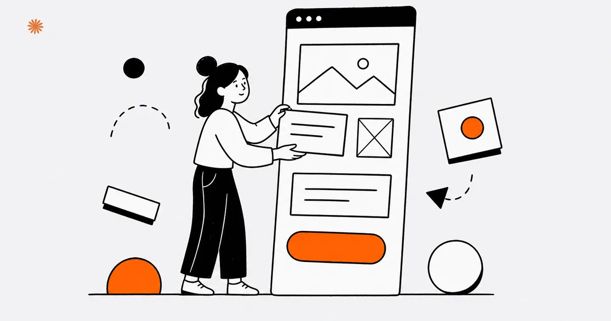
A landing page that converts has few elements, always the same ones: a headline that repeats the promise of the ad, a benefit explained in concrete terms, a trust signal, a single call to action, and a short form. Everything else is decoration, and it often works against the conversion.
- Headline: repeats the promise of the ad using the same words, so visitors know in a second they are in the right place.
- Concrete benefit: what the person gets and how fast, said plainly. No lists of technical features.
- Trust signal: real reviews, real cases, credentials. You make the promise; other people supply the credibility.
- One CTA: the same action, repeated down the page. Ask for two different things and you often get neither.
- Short form: only the fields you need to follow up. Every extra field adds friction and costs you leads.
These are the same principles behind a website that converts, concentrated on a single page with no exits: no full navigation menu, no links to ten different sections. Visitors should be able to do exactly two things: take the action or leave. It sounds brutal, but it is what makes the page measurable and improvable.
A practical rule for the form: for every field, ask yourself whether you really need it before the first contact. Name and a way to reach them is almost always enough; the rest you ask on the call.
Speed and mobile
Most of the traffic your campaigns send, especially from Meta and TikTok, browses on a phone. If the landing page is slow or awkward to use with a thumb, the click you already paid for is lost before the page even appears. Speed and mobile are not technical details: they are budget.
A lightweight landing page opens fast even on a mediocre mobile connection: optimized images, no unnecessary scripts, no heavy carousels. The Core Web Vitals, the metrics Google uses to grade a page's speed and stability, are a good benchmark here too: a page that snaps into place and does not shift around while loading keeps more visitors.
Then there is ergonomics: the landing page should be designed mobile-first, meaning built for the small screen before anything else. Text readable without zooming, buttons large and well spaced, a form you can fill out one-handed, a CTA always within reach. If completing the form takes rotating the phone or pinch-zooming, the conversion is already gone.
Mistakes that kill the conversion
The most expensive mistakes are always the same: too many outbound links, endless forms, an ad promise the page fails to keep, and generic messaging that fits everyone and therefore convinces no one. These are focus errors, not design errors: you fix them by removing, not adding.
- The full site menu: every item is an escape route from the path you paid to build.
- The questionnaire form: ten required fields for a simple contact request will discourage even the most motivated visitors.
- The broken promise: the ad talks about one offer, the page about another. The visitor feels misled and does not come back.
- The generic message: "quality and professionalism at your service" answers no concrete question. A CPA in Chicago and a roofer in Phoenix could both run it, and it would convince nobody in either city.
- No proof: only your own claims, with no reviews, cases, or real faces. Trust has to be shown, not declared.
The good news is that every one of these mistakes is reversible, and the page itself will flag them for you: if the campaigns bring clicks but the leads do not come, the bottleneck is almost always here. Before you touch budgets and audiences, put the ad and the landing page side by side and ask whether they tell the same story.
Are your campaigns bringing clicks but few leads? Let us look at your ad and landing page together and find where the conversion is leaking.
Let's talkFrequently asked questions
- Can I use my homepage as the landing page for my ads?
- Better not to. The homepage has many goals and many links, while someone arriving from an ad is looking for one specific promise and one action to take. A dedicated landing page converts more because it removes the distractions. The homepage can be enough only for pure brand campaigns, where the goal is awareness.
- How many fields should the form have?
- The bare minimum you need to follow up: usually a name, an email or phone number, and at most one question that qualifies the request. Every extra field raises the perceived effort and costs you leads. Collect the details later, on the first call, once the person has already chosen to talk to you.
- Do I need a landing page for every ad?
- You need a landing page for every message, not for every ad. Several ads that promise the same thing can point to the same page. If the offer or the audience changes, though, you need a dedicated page: whoever clicks has to find exactly the promise that convinced them, without searching for it.
- How much does loading speed matter?
- A great deal, because paid traffic is impatient and mostly mobile: every extra moment of waiting makes a share of visitors give up, and you already paid for those clicks. A lightweight landing page, with optimized images and no unnecessary scripts, protects your budget before it even improves your conversion rate.

DigitiNexus — Web & Design Agency
We are a team of designers and developers specialized in SEO, Next.js and digital growth for professional firms, small businesses and startups, in the US and beyond. We build websites that bring real traffic and real clients.